.jpeg)
The client says they want something "warm but not dark, minimal but not cold, modern but not too corporate." They send you a Pinterest folder with forty-seven images, half of which contradict each other. A raw concrete wall. A rattan pendant light. A maximalist Rajasthani haveli interior. A Scandinavian bedroom with nothing in it.
You smile. You say "absolutely, I understand exactly what you mean." And then you go home and stare at your screen trying to figure out what on earth connects those forty-seven images.
This is the mood board problem , and it is also exactly why the mood board, when done well, is one of the most powerful tools a designer has. Not just for showing the client what the space will look like. For figuring it out yourself first.
What a Mood Board Actually Is , And What It Is Not
A mood board for interior design is not a shopping list. It is not a presentation of the exact sofa and exact tile you have chosen. Those come later , that is a material board, a specification board, an execution document. The mood board is upstream of all that.
Think of it as a translation layer. The client has feelings about their space , they just cannot articulate them yet. Your job is to intercept those feelings, organize them into something coherent, and reflect them back to the client in a visual format they can respond to. Yes, no, warmer, more playful, less formal. That conversation is the whole point.
A mood board is the compass. Not the map.
Interior design director Kristen Dee, writing about her process for a hotel bungalow project, described how she began with a single word , "coastal" , and then moved from abstract images (smooth pebbles, whitewashed wood, particular blues) toward concrete ones (a specific chair, a light fixture, a rug). The mood came first. The objects followed. That sequence is not accidental , it is the correct order.
Why Designers Skip This Step and Regret It
Skipping the mood board is usually a time-pressure decision. Project starts, brief lands, you feel the urgency to move quickly into execution. Mood board feels like an optional preamble.
It is not optional. It is load-bearing.
Without a mood board, you present a 3D layout or specification to a client who has no emotional reference for what they are looking at. They say they like it. Then the materials arrive and they say it does not feel right. Then you redo two months of work for reasons neither of you can properly articulate.
The mood board conversation, had properly at the start, eliminates an enormous proportion of that late-stage confusion. When a client responds to a mood board by saying "yes, this , except can we make the green darker and the materials feel less industrial" , that is the most useful brief you will ever receive. Specific, visual, emotionally grounded. That is what you build from.
Art director John Henry Pitts, whose client work spans fashion and interiors, described the mood board as "a shot of visual adrenaline" , a way of emotionally galvanizing everyone on a project toward the same vision. The exciting part of any project is in the originating idea. The mood board is how you keep that excitement alive as it passes from you to the client to the contractors to the workmen.
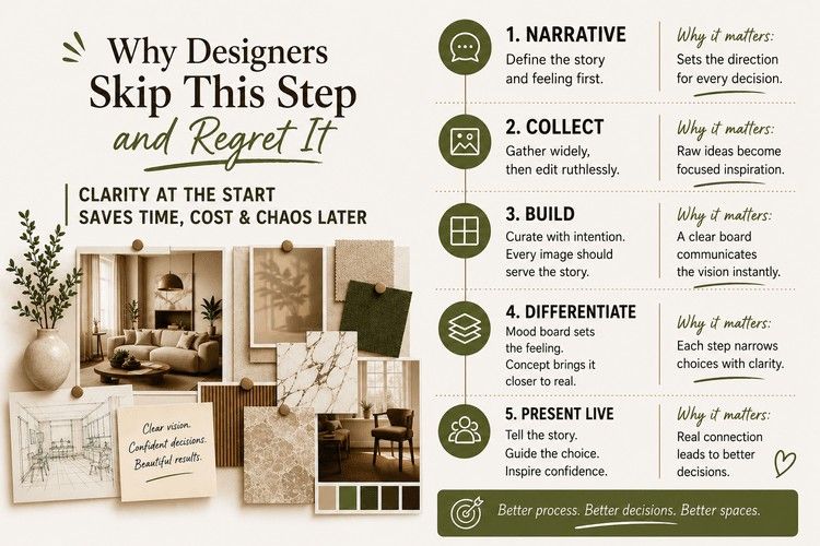
Step 1: Start With the Narrative, Not the Images
Before you open Pinterest. Before you pull a single reference. Before anything , ask yourself what story this space is supposed to tell.
Not what it should look like. What it should feel like to be inside it.
A hotel lobby that makes business travellers feel like they have arrived somewhere that understands them. A family home that holds multiple generations without any of them feeling crowded. A café that feels like a Tuesday morning discovery , the kind of place you immediately want to tell someone about.
What is the atmosphere? Write it down in three adjectives. Write a sentence. Scribble something on paper. This narrative is your project compass , the thing you return to every time a decision needs to be made.
Frank Gehry's Fondation Louis Vuitton began, reportedly, with a single image: the billowing sail of a ship. His earliest sketches were chaotic, minimal, abstract. But that one visual idea , billowing, movement, transparency , became the DNA of an entire building. One strong inspiration creates an entire ecosystem. That is also how a good interior design mood board works.
Step 2: Collect Everything First, Edit Ruthlessly Second
Once you know your narrative, you can start collecting. And the first pass should be generous. Too generous, probably.
Pull images from everywhere , Pinterest obviously, but also Behance, Dezeen, architectural photography accounts on Instagram, old design magazines if you have them, your own photography, fabric swatches you have handled in a showroom, a screenshot of a film scene with exactly the right quality of light. Anything that resonates with the story you defined in Step 1.
Do not edit yet. That comes later.
The critical skill is what happens after you have collected everything , which is when you look at sixty images and accept that perhaps forty of them need to go. This is where most people struggle. The images you chose represent your effort and your taste, so throwing them out feels like a loss. But a mood board with twenty images that all say the same thing is infinitely more powerful than a board with sixty images that argue with each other.
Be ruthless. The images that do not pull in the same direction as your core narrative , out. Even if you love them individually. Even if you spent twenty minutes finding them.
A useful test: if someone looked at your board without knowing the brief, could they describe the atmosphere you are trying to create? If not, you still have editing to do.
Turn ideas into beautifully curated spaces. Learn professional styling, mood boarding, and spatial storytelling with Kaarwan's Interior Styling Master Class.
Step 3: Build the Board With Intention
The layout of your mood board is not decoration , it is communication. The structure tells a story of its own before the client reads a single image.
A minimal concept needs breathing room. White background, clean grid, maybe four or five images with significant negative space between them. No clutter. The restraint is part of the message.
An organic, layered concept benefits from asymmetry , overlapping images, soft neutral background, materials that suggest texture and imperfection. The composition mirrors the concept.
A bold, maximalist brief calls for density , images that push into each other, colour that jumps, a layout with energy.
Keep a few structural principles in mind:
Limit yourself. Between five and ten images is usually right. If you cannot reduce it below fifteen, you probably have not finished editing.
Crop aggressively. Rarely does a full image need to appear. A close detail of a texture, a fragment of an object, a corner of an architectural photograph , these communicate atmosphere more effectively than showing everything.
Be consistent in colour correction. One sun-bleached vintage photograph sitting next to a high-contrast modern interior editorial does not create richness , it creates noise. Adjust brightness and tone across images so the board reads as one cohesive thing, not as a collage of different sources.
Choose two or three anchor colours. Pull them from the images themselves. This creates a colour palette that feels inherent to the concept rather than imposed on it.
Add text sparingly. A single evocative word placed somewhere on the board , "unhurried," "grounded," "curious" , can do more work than a paragraph of explanation. But it needs to be the right word, in the right typeface.
Also Read: Crafting Effective Moodboards a Comprehensice Guide.
Step 4: Understand the Difference Between a Mood Board and a Concept Board
This distinction is worth understanding before you build anything for a client, because conflating them causes confusion in presentations.
The mood board is pure atmosphere. Feeling and texture and light. It rarely shows the exact furniture or tile you will specify. It communicates how the space will make someone feel.
The concept board is a step closer to reality , it merges the atmosphere with some actual project elements. The silhouette of a sofa that matches the brief. A swatch of the fabric being considered. A macro photograph of a stone sample.
The material board (or furniture board) is the execution layer , specific products, exact finishes, dimensions, cost references. This is for contractors as much as clients.
For most residential and hospitality projects, you move through all three in sequence. The mood board gets emotional approval , yes, this is the feeling we want. The concept board tests specific directions. The material board locks decisions for execution. Each stage filters the range of choices. Each stage gives the client something they can respond to with the language they have access to at that point.
Step 5: Present It Live , Not Over Email
Send a mood board by email and the client will look at it between meetings, on a phone screen, at bad resolution, without context, while thinking about something else. They will say something polite and noncommittal. You will not know if they connected with it.
Present it in person or on a call where you can see their face.
There is a strategy worth knowing here. Before you show the board , repeat the brief back to the client. Verbatim, in their language. "You told me you wanted something that felt warm and personal but not fussy. That the space needed to work for your mother visiting and also for entertaining clients. That you hated the word 'Instagrammable' but still wanted the kitchen to be something you were proud to show people."
This does two things. It proves you listened, which makes them immediately more open to your vision. And it establishes the criteria by which the mood board should be judged , before they have started judging it by something else.
Then, when you present the board, explain the why behind choices. Not "here is a blue sofa." But: "I chose this particular texture because it anchors the space and creates warmth against what will be quite cool stone underfoot. The blue is the same family as the colour you described as feeling like an exhale."
The client does not need to understand design. They need to understand your reasoning. Those are different things.
One more thing: present one core narrative, two execution options. One mood board. Two concept directions. Something like: "Direction A , light, organic, the feeling of morning light on linen. Direction B , deeper, more saturated, evening quality." This shifts the conversation from "do I like this" to "which do I prefer." Much more productive. Decisions get made. Revisions compress.
Also explore: Interior design fundamentals through Kaarwan's practical mini workshop.
Tools Worth Knowing in 2026
The question of what to build mood boards in is genuinely secondary to the question of what to put in them. But tools do matter.
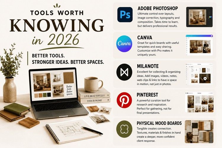
Adobe Photoshop remains the most control , complete freedom over layout, image correction, typography, and composition. It takes longer to learn but the output is more professional than most alternatives.
Canva is genuinely good for quick boards, has mood board templates worth starting from, and the share functionality makes client presentation simple. The limitation is that every board risks looking like it came from the same template. Customise aggressively.
Milanote is particularly strong for the collection and organisation phase , it allows video, audio, web clips, and links alongside images, which is useful when you want to show a client a space in motion rather than just in a photograph. Digital mood boards that include short video clips and material textures communicate atmosphere more richly than static images alone.
Pinterest is a collection tool, not a presentation tool. Build boards there during research. Refine and curate elsewhere.
Also Read: Free 3D Interior Design Tools For Students 2026
Physical mood boards , actual printed images, material swatches, paint chip samples, pieces of fabric arranged on a board , have a quality of presence that digital boards cannot replicate. For high-value residential or hospitality projects, handing a client something they can touch, hold, and live with for a day before they respond creates a different quality of engagement. Do not dismiss the physical format simply because digital is faster.
Ready to create mood boards that tell compelling design stories? Join Kaarwan's Interior Styling & Spatial Decoration Master Class and elevate your creative process.
A Common Mistake That Kills Otherwise Good Boards
Too many images from too many different visual sources without any correction work done to them.
A raw photograph taken on a phone sitting next to a perfectly lit editorial shot sitting next to a vintage scanned magazine image , each one telling a different visual story in terms of light quality and tone. The content of the images might all point in the right direction. But the visual dissonance between them communicates disorder.
Spend thirty minutes in Photoshop adjusting brightness, contrast, and colour temperature across every image on the board. Pull them into the same visual world. This single step, more than almost anything else, is what separates a professional mood board from a student exercise.
Every project starts with someone having a feeling they cannot articulate. Your job as a designer is to make that feeling legible , first to yourself, then to the client, then to everyone involved in bringing the space to life.
The mood board is how that translation happens. It is not a deliverable. It is a conversation. The most important conversation in any design project.
Get it right at the beginning and every decision that follows has somewhere coherent to refer to.
Take your interior design skills to the next level with Kaarwan's Advanced Interior Design Certification Course and gain industry-relevant expertise.
FAQ
Q1: How many images should a mood board have?
Between five and ten is usually the right range. Less than five and you risk the board feeling thin and underexplored. More than ten and you are usually including images that do not need to be there. The discipline of limiting yourself forces better editing decisions, and better editing produces a clearer narrative. If you cannot cut below twelve images, the mood board probably has not found its direction yet.
Q2: Should a mood board show the actual furniture and materials I will specify?
Not usually , that is the job of a concept board or material board, which come later in the process. A mood board communicates atmosphere and feeling. It creates emotional approval before the client needs to evaluate specific products. Mixing the two stages creates confusion: the client gets stuck evaluating whether they like a specific sofa when what you actually need is for them to confirm whether the overall direction is right.
Q3: What software is best for creating mood boards?
Adobe Photoshop gives the most control and the most professional output. Canva is faster and adequate for many projects. Milanote is excellent for boards that include video and text alongside images. Pinterest is a research and collection tool, not a presentation tool. Physical boards , printed images, material swatches, paint samples on a physical board , communicate differently from digital and are worth using for high-value projects where you want the client to have something to hold.
Q4: How do I get a client to give me useful feedback on a mood board?
Present it live rather than sending it by email. Before showing the board, repeat the brief back to the client in their own language , this establishes the criteria before they start evaluating. When presenting images, explain the reasoning behind each choice rather than just showing the board and waiting. Give them two concept directions to choose between rather than one to approve or reject. The phrase "which of these feels closer to what you want" generates more useful information than "do you like this?"
Q5: What is the difference between a mood board and a vision board?
A vision board is personal , it reflects aspirations, life goals, things you want to move toward. A mood board is project-specific and professionally purposeful , it defines the atmosphere and visual direction of a specific design. The structure and tools overlap significantly. The purpose is different. For design practice, you are always working with mood boards. Vision boards are what designers make for themselves when they are defining the kind of career and practice they want to build.